Would you like to advertise on this site? and/or share tips and tricks with me to add? Simply email me at j4atkinson@gmail.com for information.

To have your item featured in our weekly featured ad, let us know at j4atkinson@gmail.com.

Sunday, March 15, 2009

Expanding and filling text


My friend Kerri asked me to make this tutorial so she knew how to make these cool custom letters. It's a little bit confusing but you'll see after trying it's super easy and a lot of fun.

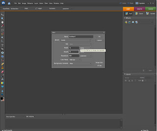
So to begin open a new file, any size, I chose 12x12
Then select your typing tool and the font that you want. I chose comic sans
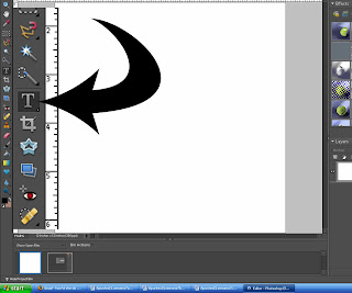

Then type whatever your wanting typed. Then we want to select the wording. A very simple, neat trick to easily select an entire layer is make sure you are on that layer, so in this case the type (tips and tricks) layer. Then hold your ctrl key and click on that layer on the layer palette as arrowed to below. This will put little marching ants as they are called around your words.
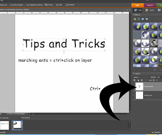
Then, if you chose a less chunky font or a chunky font and just want to make it chunkier (which for this I suggest you chunky up your font so you can see the paper better). Go to select - modify - expand. A little box will pop up and you enter the number that you want it to expand to. So 1 is the smallest and it's totally up to you to decide what size you'd like to expand it. Play around so you can figure out what's best for you. I chose 4.


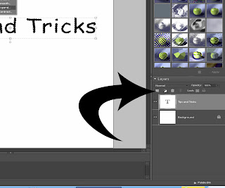
Now that the little marching ants have expanded around our letters, we need to fill that layer with a color. Create a new layer (the arrow shows you where to click). Make sure the new layer is ABOVE the type layer.

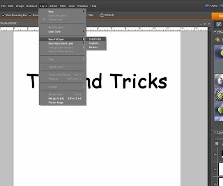
Then go to layer - new fill layer - solid color. When the box comes up, you just choose the color you want. It doesn't matter what it is because we will be covering it up with paper anyway.
Now, open your paper that you want to fill the letters. Make sure the paper is ABOVE the fill layer you just made. So it should be the very first layer in the layer palette. You can see where mine are in this picture. Then click ctrl+g. The paper becomes the letter.
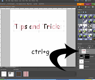
You can stop there or we can expand a little around the letters and add a solid color like I've done. Either way is great, and sometimes I do this sometimes I don't.

To start you want to hide the solid white background. To do this click on the little eye next to it on the layers palette. And then go to layer - merge visible. This will combine everything that's visible and make it one thing.
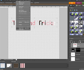

Then you follow the same steps above.

1. ctrl+layer
2. select - modify - expand (choose whatever you'd like, I did 3)
3. then create a new layer BUT this time the new layer will go below our wording (otherwise the new color will cover our paper)
4. layer - new fill layer - solid color (choose a color)
5. if the marching ants are still there when you're done, hit ctrl+d.

And there you have some cool letters that will match your paper perfect.

For any questions, suggestions, requests, let me know j4atkinson@gmail.com or leave a comment.

Wednesday, February 25, 2009

First in the recipe series

I decided to start a weekly (or more often) recipe to this blog. I'm not the cook of the family but I do make a few things and I do enjoy many things so I can add those recipes here as well. This first one if very simple and very yummy. Enjoy!! And you if you have a special recipe you'd like to share, let me know j4atkinson@gmail.com.

Also, feel free to copy and save or print any of these recipes, they are free and for you to enjoy. And all will be in digi scrapbook form (because I may not cook but I love digi scrapping) so your recipe book will be fun and girly.

Thursday, February 5, 2009

Great time for Scentsy

Right now is a great time to order some Scentsy. They are having a special...10% off items in their Fall catalog. They are clearing out some items to make way for new product.

To order click here

I have some great incentives if you want to host a party, we can do it online or an in-home party, let me know.

Sunday, January 18, 2009

Design your own blog

These are the instructions to making your own background for your blog. These seem a bit intense but once you start doing it, it all makes sense. However, if it doesn't, I am here to help. Once you have this format down, we will work on recognizing the html code so you can change up the blog layout and not just the background.

Changing your blog.

To change your blog you want to first find paper that you like. I like places like www.shabbyprincess.com, www.heatheranndesigns.com, www.sweetshoppedesigns.com and others. There are many that provide free kits to download which is amazing. So look for freebies. Then once you find and download the paper you like, save the ones you want to use in an online photo saving program. I prefer photobucket.com but you can use whatever you like.

Then once the papers are saved copy the DIRECT LINK for that paper. Go to layout/html in your blogger dashboard. I have bolded and highlighted where you are to insert the different pages. The first one is for the main background page, the next is for the header outline and the last is for the center page where you write. Once those are in you can click preview to make sure you like it. Before you save you NEED to go to the category HEADER. Under this category, right below the spot where you put the direct link code for the paper, you will see width and a number, probably 765 px. You HAVE to change that to 720 px and then click save.

To make a header you will need photoshop, elements, scrapbook deluxe or some other program like this to make it. Make the paper size a 12x5 and the creativity is up to you. Once your header is done, save it as a JPEG. Then go into layout/page elements in your blogger dashboard and click edit on the right hand side of the header location. You will upload the new header from your computer. Be sure that the use instead of box is clicked and the shrink to fit. Then save.

After that go back into your HTML code location and change that number you just changed to 720 back to 765 and save. This will make it fit perfectly. The reason you are switching it the first time and then again and you must do it every time, is because if you don’t it will just get bigger and bigger and you don’t want that.

From here you can go to layout/fonts and colors and switch up the colors to your liking and save.

Now you’re all set. And as always, shoot me an email or comment on my blog if you have any questions.

******The code below is just so you know where to put it, do not copy this and paste it, you already have the code so it’s not necessary. Just use this as a reference in doing yours and paste the direct links in your current html and not this one****

body {

background:$bgcolor; background-image:url(INSERT DESIRED BLOG MAIN BACKGROUND HERE, USING THE DIRECT LINK CODE FROM PHOTOBUCKET OR OTHER PHOTO SERVER);background-repeat:repeat-xy;

margin:0;

color:$textcolor;

font:x-small Georgia Serif;

font-size/* */:/**/small;

font-size: /**/small;

text-align: left;

}

a:link {

color:$linkcolor;

text-decoration:none;

}

a:visited {

color:$visitedlinkcolor;

text-decoration:none;

}

a:hover {

color:$titlecolor;

text-decoration:underline;

}

a img {

border-width:0;

}

/* Header

-----------------------------------------------

*/

#header-wrapper {

background-image:url(INSERT THE DIRECT LINK CODE FOR THE DESIRED PAPER THAT GOES IN THE HEADER OUTLINE);background-repeat:repeat-xy;

width:765px;

margin:0 auto 20px;

border:1px solid $bordercolor;

}

#header-inner {

background-position: center;

margin-left: auto;

margin-right: auto;

}

#header {

background-image:url();background-repeat:repeat-xy;

margin: 25px;

border: 1px solid $bordercolor;

text-align: center;

color:$pagetitlecolor;

}

#header h1 {

margin:5px 5px 0;

padding:15px 20px .25em;

line-height:1.2em;

text-transform:uppercase;

letter-spacing:.2em;

font: $pagetitlefont;

}

#header a {

color:$pagetitlecolor;

text-decoration:none;

}

#header a:hover {

color:$pagetitlecolor;

}

#header .description {

margin:0 5px 5px;

padding:0 20px 15px;

max-width:700px;

text-transform:uppercase;

letter-spacing:.2em;

line-height: 1.4em;

font: $descriptionfont;

color: $descriptioncolor;

}

#header img {

margin-left: auto;

margin-right: auto;

}

/* Outer-Wrapper

----------------------------------------------- */

#outer-wrapper {

background-image:url(INSERT THE DIRECT LINK CODE FOR THE DESIRED PAPER THAT WILL BE WHERE YOU TYPE HERE);background-repeat:repeat-xy;

width: 60%;

padding:2.5% 5%;

margin-left:15%;

margin-right:25%

text-align:left;

font: $bodyfont;

}

Monday, January 5, 2009

Long time no post

I promise I haven't forgotten about this site. It's been busy with the holidays and we are doing some house renovations and I'm going on vacation next week, so I have been a major slacker. I promise I have some great stuff coming, like how to customize your blog! So check back this week, there will be some new stuff. I hope everyone had a great holiday!