Would you like to advertise on this site? and/or share tips and tricks with me to add? Simply email me at j4atkinson@gmail.com for information.
To have your item featured in our weekly featured ad, let us know at j4atkinson@gmail.com.
Saturday, December 20, 2008
Liquify
Now that we have ribbon making down, a great technique to learn is how to make it look more realistic when you add an embelishment to your ribbon. Like pinching the ribbon or making it look like it's hanging down.
First open your ribbon, then open a new file that is 12x4. You'll want to drag your ribbon onto that new page. This is so we have space to work with our ribbon.
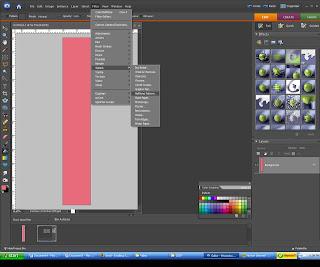
Now go to filter/distort/liquify. Depending on how much kinking/bending you want to do, you'll want to choose a different brush size. I chose a large brush 430 because I wanted a smooth bend in my ribbon. Play around with it and see what it does. If you don't like it, simply click revert and it will undo all the changes. Once you're happy with it, click ok.
There you have it, a realistic bend in your ribbon. Just add your charm and your set.
Next time, we'll learn how to make it so the charm and other items such as paperclips appear to be partly behind paper/ribbon/images and the rest not, the realistic look.
Monday, December 15, 2008
handwashing
This is kind of a silly tip, but kind of not. I am obsessed with washing my hands. I am a huge germaphobe, trying to recover OCD maniac. Well, a great tip I just heard from a Dr. -- the perfect amount of time for a person to wash their hands, keeping our little kidlets in mind, is the same amount of time it takes to sing the ABC's or Twinkle Twinkle Little Star. What a great idea.
On a similar note, when we started brushing my daughter's teeth she would fight it, she hated it so we decided to sing the ABC's and she loves it and has not faught getting her teeth brushed since. So, it sounds like the ABC's are a trick for several things.
Monday, December 8, 2008
Scentsy
I recently became a Scentsy consultant. If you haven't heard of Scentsy it's this amazing home fragrance system. Scentsy candles are a wickless, smokeless, and leadless candle system. There are over 80 wonderful scents to choose from. There is a scent for everyone and a warmer for all tastes. Right now, I am having a special, if you book a party with me (the parties are in home and online, so if you're not in the Albany, NY area by me, it's ok, you can do it on your own in your house or online only--or both and still receive the benefits) you will receive one free plug-in warmer of your choice for free. Let me know if you're interested and check out my site.
Scentsy
Scentsy
Friday, December 5, 2008
Christmas gift idea
Can you believe that right now at More Than Words Design, these are only $10??!!! Fabulous price and fabulous gift. You get to choose a charger color (red, silver or gold) and tell More Than Words Design the last name you want on it! If it is being shipped out of state (they are based in Georgia) there is a $5 flat shipping charge no matter how many you order!!! Just email Kerri at kerri@morethanwordsdesign.com and place your order. Check out their website www.morethanwordsdesign.com for other great deals but to order these be sure to email them so you can get the special price.
Wednesday, December 3, 2008
Two in one day :)
That's right, two posts in one day. I feel it's fitting since I haven't been around for at least a week. As all of us are I'm sure, I've been super busy with the holidays and then I'm doing a craft fair on Friday and two Scentsy parties this weekend, phew, busy but all of it's fun. But, I have some great stuff to add so why not do two in one day.
This one actually comes from my good friend, Amanda. Unfortunately for her, but fortunately for us, her youngest daughter got her cute little hands on a permanent marker and decided to display her artistic abilities on the counter and linoleum floor. That can't be a pretty sight to see!
So off my friend went to find help. She used Mr. Clean on the counters but, as I too learned from personal experience, Mr. Clean does not work at all on linoleum floors. I'm not sure why, but I too have scrubbed my floor with it to get a grape juice stain out and it didn't work, just like she didn't get the marker out. However, the good new is, toothpaste and baking soda remove permanent marker. Amanda said you can't even tell there was marker on the floor. Hopefully you won't have to test this one out, but rest assured if you do, there's a way to get it out. Thanks Amanda!!!!!
**All tips are much appreciated, email me at j4atkinson@gmail.com.**
Grosgrain ribbon
So often I make a page and realize I don't have the perfect matching ribbon to go with it. No worries, let's make our own ribbon. I think ribbon adds a lot to a page and it's super easy to make. If you prefer not to make your own and you have mounds of ribbon sitting in your craft room like I do, you can easily scan your ribbon in and use that to match your page but really this is super easy.
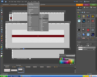
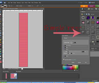
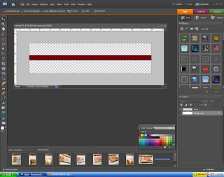
Start by opening a new document that is 12 inches in height and .5 wide. For now we want our image to be vertical and we will later switch it to horizontal (ignore that it is horizontal in this picture, I forgot to get a picture of the page when I first opened my image...whoops).
Now fill in the color to be one that matches your paper. You can use the eye dropper to copy the color and paint bucket to drop the color into your ribbon. Once you have your color as your foreground color, click on the background color (these are the two colored squares on the bottom left of your screen). You'll want to choose a color that is a couple degrees (if that's the word?!) darker than your ribbon color -- this will make sense as to why in a minute.
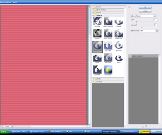
Now, go to filter/sketch/halftone pattern.
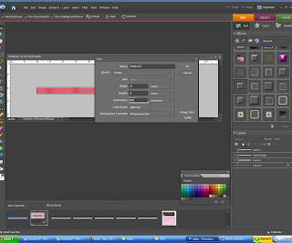
You can choose whatever you feel looks best but for reference I chose to do size 7 and 23 contrast, click ok and you can see that you now have the makings of grosgrain ribbon.
Now, remember how we had our background color changed to a couple shades darker then our ribbon color...go ahead and make this your foreground color, choose the brush and you'll want to choose a small brush size like 60. While holding down the shift key (remember that gives us the perfectly straight line) go around the edges of the ribbon to give it that finished edge of real ribbon.
To make it a little more realistic I decided to add a simple inner bevel to mine. I did a very light bevel but you can do as little or as much as you'd like or none at all.
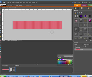
Now you can go to image/rotate 90 degrees to the left. You can stop at that or you can add ripples to your ribbon for a realistic touch. Some people add a gradient when doing this but I don't really like that because when you try to resize it, it gets all screwed up and I don't like that. So, what I decided to do was burn lightly where I wanted my ripples.
I chose the burn tool, changed the opacity to about 60% and chose the default brush of 300. Then I followed my ruler at the top and while holding down the shift key so I can make a perfectly straight line, I drew my line at about every inch.
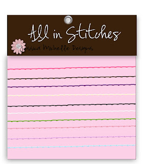
You now have a perfectly matching ribbon. I chose to add some thread along the edges just for fun.
If you would like to purchase a beautiful pack of 10 stitches go to here ETSY
Friday, November 21, 2008
Popping Color in a Black and White Photo
A very cool effect is popping a little bit of color in a black and white photo. When I first set out to do this I couldn't find any tips on doing it and therefore bought an action to allow me to do it. Which is great, I love the action but in reality there's a very easy way to do this. You'll want to open your original color image.
Then you'll want to make a copy of the image by clicking control + j.
You'll want to remove the color in your new image. Go to enhance/adjust color/remove color.
Now that you have a new black and white layer on top of your color layer, you'll want to select the erase tool. Pick the area that you want the color to pop through and you'll want to zoom in on that area. **To do an easy zoom, click ctrl and the + sign... to zoom out click ctrol and -.** Now that we have a bigger view of the area, start erasing. Make sure you're on the b&w layer. You'll start seeing your color pop.
Monday, November 17, 2008
Making a digi scrapbook page
One of my most favorite hobbies is digital scrapbooking. It's a little scary getting started but once you know a few basic things, it will be so easy. There are many amazing websites out there that offer free/cheap digital kits. Some of my favorites are www.heatheranndesigns.com, www.shabbyprincess.com, www.sweetshoppedesigns.com. There are hundreds of more out there, if you google it, you will find a ton.
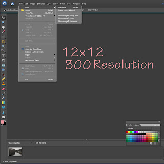
To begin you'll want to open a new document. I do my pages in 12x12 but the size is up to you. I've also done 6x6, 8x8, 8.5x11. You can do anything. You'll also want to make the resolution 300, that maintains great quality.
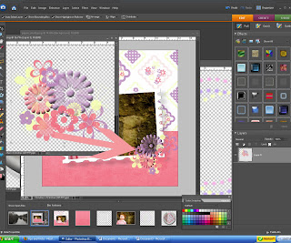
To move paper, pictures, embellishments, etc., to your page all you'll need to do is open your add- ons, click and hold on them and drag them to your blank file. So to start you'll want to add paper, click and drag the paper to the blank file, then the picture and then all the other elements.
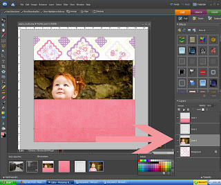
The thing that tends to terrify people the most about this is the layers. On the right hand side of the screen you'll see everything that you've added or done to that page. The layers simply tell you what's there and the order in which they are on your page. If when you're moving your stuff over and some of it is covered up by something else, like in this page, my picture is covered by a paper, all you do is go to where it shows your layers, click on the picture and drag it up so it's before the paper. You can do this with all layers on your page.
Also, as you can see on this page I didn't re-size anything before adding it to my page, that's no problem, if you click on the image to select it, click and hold on the corner square, then drag it in. This keeps it perfectly proportional but shrinks the size.
Add all your layers and there you have your digital scrapbook page.
Friday, November 14, 2008
Cloning, creating living monstrosities and cool photos
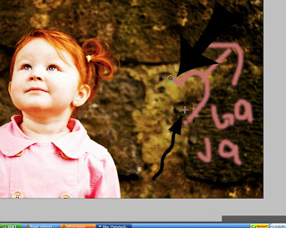
Have you ever had a great photo that you just love except for one thing? I have and lucky for us, we can fix it. I was editing photos and didn't find a good picture for demonstration so I made my own graffiti, ha. So, pretend it's real and now that it's there, let's get rid of it. ***As with all my images, to make it bigger and more easily seen, simply click on the image***
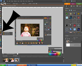
Photoshop has this amazing tool, the cloning tool. Go ahead and click on it.
Now you'll want to find a part of your photo that is what you are wanting to clone and basically replace what you're trying to get rid of. In our case, it will be the rock surrounding the graffiti. It will need to be something that is close in proximity to what we are covering up. Once you find the replacement option click alt and then left mouse click. It has now recorded what you are cloning and you are ready to click over the graffiti and watch rock show up. I like to use a small brush size but you may want to use a bigger one or adjust it as the size gets smaller.
The circle that I pointed to in this image is the brush covering up the graffiti and the + is where it is copying from. You may need to alt click a few times to move the + out of the way of the graffiti or else you will be covering up graffiti with graffiti. This may sound confusing, but I promise once you start you will know exactly what I'm saying.
We now have a picture that was pretty much useless before. How cool is that tool?!! You can use it for anything. To get rid of people, cars, poles, animals, garbage, anything.
Monday, November 10, 2008
what program are you using
If I have enough full blown Photoshop users, I will try and do double instructions, one for Elements and one for Photoshop. Let me know what you're using and I will try and help both. Also, soon I will be getting CS3 so I can add tips for that as well.
Thursday, November 6, 2008
Advice
I'd love to hear from you as to what you would like to learn in Photoshop? I have so many things I want to share but I just don't know if they are useful or what people want to learn. So leave a comment and let me know.
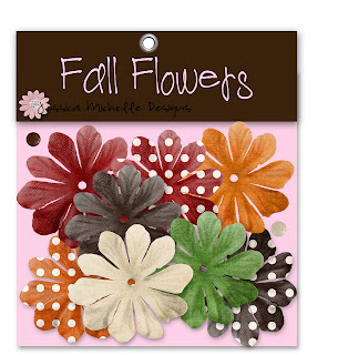
And for your help, one lucky person will win these digital flowers to be used while digi scrapping or for your story boards like you just learned. If you would like to purchase these flowers (in case you don't win!) email me at j4atkinson@gmail.com.
straight line
I was sharing with a friend earlier today a neat trick in Photoshop and I of course had to come here and add it. If you are wanting to do something in a straight line, i.e. brush, no need to stress over holding your hand still so you get it perfect, simply hold down the shift key while drawing your line and voila you have a straight line, it won't let you deviate from that. How cool is that!?! If you like learning little tips like this or other short keys, let me know and I will add them.
Wednesday, November 5, 2008
Story boards
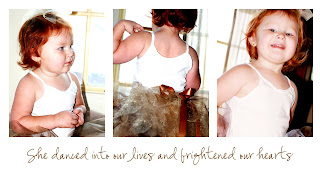
I love storyboards. They are a great way to show off several corresponding pictures all together, plus a cute little saying to top it off! So let's learn how to make them. It's really, really easy and completely customizable. So let's start with a new document. I chose 10x6 but you can do any size you want.
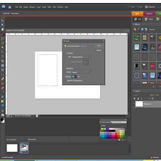
Then we are going to want to add our squares. Add a new layer first. Then select your rectangular marquee tool on the side tool bar. We want to do a fixed size so we don't have to worry about matching up our squares perfectly. To do this, go to the top tool bar and click where it says normal in the drop down menu, switch it to fixed size. I chose 3 in x 4in but you can do whatever you want. Click on the document and you will see your rectangle pop up.
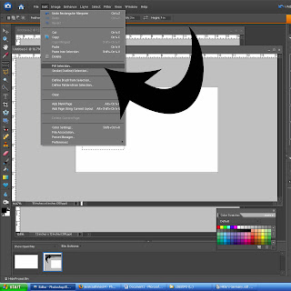
We now want to fill that area with a color. So while the rectangle is still highlighted go to Edit/Fill Selection.
A box comes up and if your foreground color isn't black, click d and that will turn your foreground color to black. Then click ok. Our rectangle is now colored in.
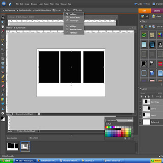
Now that the first one is done, click ctrl+j to duplicate it. Do that twice. Now there are three rectangles. Now you'll need to select all of them at the same time. Click on one while holding the shift key and then click on the rest of them.
Now to align them. With all of them highlighted, go to the top of the screen and you'll see an align button, click that and choose top edges. Then under distribute (right next to it) choose horizontal centers. They are now aligned and we can add pictures.
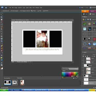
Choose the images you want to use, make your corrections and drag the first one over. Choose in your layer palette which rectangle you want your image to become (left, center or right). Move your image above that one and click crtl+g. Your image now became that rectangle. Resize as necessary and repeat for all three.
You now have a story board. You can now add a nice saying, a shape, embellishments, brushes, or leave it blank. It's all up to you. Have fun!!!
Monday, November 3, 2008
And the winners are.......
Thank you everyone who entered and everyone who gave wonderful items away. We had a great first ever gift giveaway and I don't think it will be the last.
The winners have been notified by email but will be notified again, now.
The winner of the:
Headbands - Alisha D.
mini notebook - Leslie
Christmas card - Charissa
Brooklyn's bows - Amanda S.
Sliver Chic pendant - Melissa/Missliss
Iddy Biddy Bling - Jamie
Funky Polkadot - April
Congrats to all the winners and check back often for great tips and more giveaways. There are some great tips coming and I'm really excited.
Sunday, October 26, 2008
Gift giveaway!!!!
The first ever gift giveaway is here for Tips and Tricks and we are so excited. Hopefully this is the first of many. We have so many great companies that have offered some of their wonderful, handcrafted products for this giveaway.
So here are the rules. #1 Leave your name (first name is all that's needed). #2 leave your email address so I can contact you if you win (if you are worried about privacy, simply email me at j4atkinson@gmail.com with your email and name) and finally, #3, tell me something you are interested in learning more about (it can be simple like Photoshop, cooking, sewing, etc.). Simple as that.
And as an added bonus, you can get extra entries if you simply do one or all of the following:
1. If you put a post on your blog about the giveaway with a link to this site, let me know in a comment or email with your site address and your name will be added twice;
2. If you add a permanent link to this site on your blog, you will be entered five extra times (be sure to let me know you did, with a link to your site, through email or comment); and/or
3. If you let your friends know about this and they enter and in their comment leave your name as a referral, your name will be added twice.
Scrap-n-Scribe
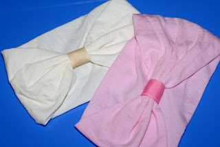
Scrap-n-Scribe makes adorable (custom if desired) journals, spa kits, cards, hairbows, headbands, gift tags, and much much more. There are so many great products and you won't be disappointed. For the winner of this you will be getting two nylon interchangeable headbands. Ever wonder where people are buying nylon headbands that are so popular right now? Well, wonder no more, it's scrapnscribe.com. You will get one light pink and one creme headband. These are perfect because they won't leave a mark on your little girl's head and they allow you to add the bow of your choosing by simply attaching it to the center ribbon. It saves you money because you don't have to buy a ton of headbands to match your outfits. Just buy one or two headbands and swap out the bows accordingly.
Scrap-n-Scribe Etsy
Scrap-n-Scribe.com
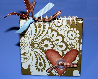
Someone will also win this adorable mini-notebook from Scrap-n-Scribe. This notebook is perfect for your purse or diaper bag. It's small enough to not take up a ton of room, but big enough for all those note, numbers, grocery lists that you need at ready access.
Bizzybee Creations
Who doesn't love custom Christmas cards! Bizzybee Creations makes the most adorable Christmas cards, custom or pre-designed (you can't go wrong either way because they are all so amazing). They also make cards for all occasions, address labels, birth announcements and more. The winner of this will get a Christmas card of your choice in digital format (it will be sent in .jpeg format via email).
Also, as an extra sweet treat, every person who enters this giveaway will receive a $5 coupon automatically. How great is that!?! Thanks Bizzybee Creations. Be sure to check out their site and order your Christmas cards now. They have some great deals going on (how's that for perfect timing!)
Bizzybee Creations
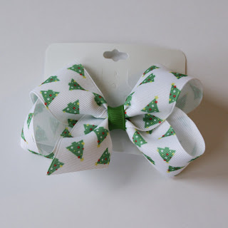
Just in time for Christmas, the winner of this will receive this adorable Christmas bow which is the perfect addition to your little girls outfit. (or yours, who am I to assume!?!). Be sure to check out this site.
Brooklyn's Bows
Iddy Biddy Bling
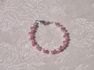
I decided to copy their description because it fits the jewelry perfect. But first, the winner of this will receive one newborn girl bracelet. Every little girl needs one.
At Iddy~Biddy~Bling we only use the finest sterling silver, bali silver, glass, stone, swarovski crystals, pearl beads and other quality findings. These bracelets are beautiful and made custom just for you! Your piece of jewelry will fit your taste and be heirloom quality.
Iddy Biddy Bling doesn't only make amazing, high quality jewelry, they also make custom shopping cart covers. I know these are high quality because I have one. I HATE shopping carts and the germs that cover them so I had to get one of these. Great prices and high quality, you can't be that.
Iddy Biddy Bling
Funky PolkaDot Giraffe
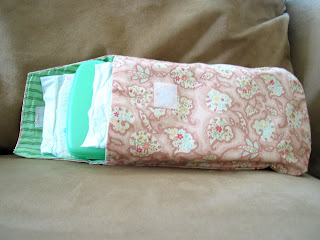
The winner of this will receive a custom diaper and wipe cover (you choose boy or girl pattern). These are so handy and stylish. I hate carrying a diaper bag, it's so bulky and heavy so this is the perfect solution to this. Not only does Funky PolkaDot Giraffe make diaper and wipe covers but they make custom burp cloths, changing pads and blankets, and you can get them all to match. Very cute! Be sure to check out their site, these will make great baby shower gifts, Christmas gifts or just a gift for yourself.
Funky PolkaDot Giraffe
So here are the rules. #1 Leave your name (first name is all that's needed). #2 leave your email address so I can contact you if you win (if you are worried about privacy, simply email me at j4atkinson@gmail.com with your email and name) and finally, #3, tell me something you are interested in learning more about (it can be simple like Photoshop, cooking, sewing, etc.). Simple as that.
And as an added bonus, you can get extra entries if you simply do one or all of the following:
1. If you put a post on your blog about the giveaway with a link to this site, let me know in a comment or email with your site address and your name will be added twice;
2. If you add a permanent link to this site on your blog, you will be entered five extra times (be sure to let me know you did, with a link to your site, through email or comment); and/or
3. If you let your friends know about this and they enter and in their comment leave your name as a referral, your name will be added twice.
Scrap-n-Scribe
Scrap-n-Scribe makes adorable (custom if desired) journals, spa kits, cards, hairbows, headbands, gift tags, and much much more. There are so many great products and you won't be disappointed. For the winner of this you will be getting two nylon interchangeable headbands. Ever wonder where people are buying nylon headbands that are so popular right now? Well, wonder no more, it's scrapnscribe.com. You will get one light pink and one creme headband. These are perfect because they won't leave a mark on your little girl's head and they allow you to add the bow of your choosing by simply attaching it to the center ribbon. It saves you money because you don't have to buy a ton of headbands to match your outfits. Just buy one or two headbands and swap out the bows accordingly.
Scrap-n-Scribe Etsy
Scrap-n-Scribe.com
Someone will also win this adorable mini-notebook from Scrap-n-Scribe. This notebook is perfect for your purse or diaper bag. It's small enough to not take up a ton of room, but big enough for all those note, numbers, grocery lists that you need at ready access.
Bizzybee Creations
Who doesn't love custom Christmas cards! Bizzybee Creations makes the most adorable Christmas cards, custom or pre-designed (you can't go wrong either way because they are all so amazing). They also make cards for all occasions, address labels, birth announcements and more. The winner of this will get a Christmas card of your choice in digital format (it will be sent in .jpeg format via email).
Also, as an extra sweet treat, every person who enters this giveaway will receive a $5 coupon automatically. How great is that!?! Thanks Bizzybee Creations. Be sure to check out their site and order your Christmas cards now. They have some great deals going on (how's that for perfect timing!)
Bizzybee Creations
Brooklyn's Bows
Brooklyn's Bows is an awesome site that you can not only purchase bows from but they also teach you how to make great bows. Rarely do you find a site that will give you great instruction when it comes to making stuff and this is one of those places. There are a ton of places that make you purchase instructions and Brooklyn's Bows is generous enough to do it for free.Just in time for Christmas, the winner of this will receive this adorable Christmas bow which is the perfect addition to your little girls outfit. (or yours, who am I to assume!?!). Be sure to check out this site.
Brooklyn's Bows
Silver Chic Jewelry
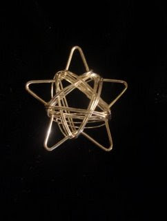
The winner of this will get this beautiful silver star charm from Silver Chic Jewelry. Be sure to check out their site for more beautiful, unique charms. They have some gorgeous charms and you can't beat the price. All of the charms will make great Christmas gifts so be sure to check them out and order yours now.
Silver Chic Jewelry
Iddy Biddy Bling
I decided to copy their description because it fits the jewelry perfect. But first, the winner of this will receive one newborn girl bracelet. Every little girl needs one.
At Iddy~Biddy~Bling we only use the finest sterling silver, bali silver, glass, stone, swarovski crystals, pearl beads and other quality findings. These bracelets are beautiful and made custom just for you! Your piece of jewelry will fit your taste and be heirloom quality.
Iddy Biddy Bling doesn't only make amazing, high quality jewelry, they also make custom shopping cart covers. I know these are high quality because I have one. I HATE shopping carts and the germs that cover them so I had to get one of these. Great prices and high quality, you can't be that.
Iddy Biddy Bling
Funky PolkaDot Giraffe
The winner of this will receive a custom diaper and wipe cover (you choose boy or girl pattern). These are so handy and stylish. I hate carrying a diaper bag, it's so bulky and heavy so this is the perfect solution to this. Not only does Funky PolkaDot Giraffe make diaper and wipe covers but they make custom burp cloths, changing pads and blankets, and you can get them all to match. Very cute! Be sure to check out their site, these will make great baby shower gifts, Christmas gifts or just a gift for yourself.
Funky PolkaDot Giraffe
Be sure to enter soon, the giveaway ends November 3rd
Friday, October 24, 2008
Organize ribbon
Do you have a gazillion ribbons like I do? I may have more than the average person just because I make bows but everyone has ribbon and if you're like me, I always found it impossible to store it. So to solve my lost, unrolled, mixed-up ribbon issues, I came up with this organization for all my ribbon. All it takes it a hot glue gun, dowel rods (I prefer using 3/16" x 12"), and I have no clue what it's called but a little wooden wheel thing. All of which are found in your local craft store next to each other. You can even purchase them all for under $10.00. It's really cheap.
All you have to do is put hot glue on the end of one dowel and attach the wooden wheel. For added security I glued the top and bottom once it was on the dowel. Then organize, organize, organize. I am all about color coordination, my closet is this way and so is my ribbon. To keep it from unraveling, I keep scotch tape with my ribbon so it's handy when I need to re-tape it after use. Then purchase or gets some use out of a box or bin. And there you have it, an easy, cheap, organized ribbon technique.
Thursday, October 23, 2008
gift giveaway
To celebrate the beginnings of this blog I will be doing a gift giveaway starting Monday. So stay tuned, some great items from awesome companies are going to be given away. Be sure to check back and enter for your chance to win. More to come on Monday.
Friday, October 17, 2008
Eye popping
I searched forever and ever to find a technique to make those eyes pop on my pictures. I finally came to the conclusion that I would just have to merge a couple things I learned and come up with my own way of doing it. I know there are some great actions out there for purchase that work beautifully but I am someone who wants to do most things on my own. So I hope you find this helpful.
Start with your SOOC image. I recently started shooting in RAW (that makes me sound like a photographer but I assure you, I am not so just go along with it) after my friend recommended it and let me tell you, it's fantastic. The images are so much better. AS ALWAYS: click on the image to make it bigger.
Make all your corrections, adjustments, whatever you want done before we begin the next step.
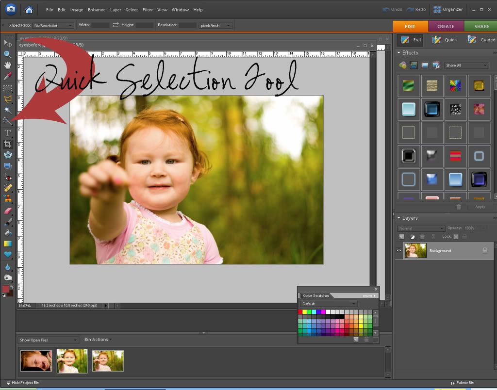
You'll want to select the quick selection tool as shown here. Once clicked, you are going to select the iris on both eyes. Once both are selected go to Enhance/Unsharp Mask and then, as stated in a previous lesson, I tend to stick with 86/4/1 but for eyes will sometimes go higher on sharpen. This one I think I did around 94.
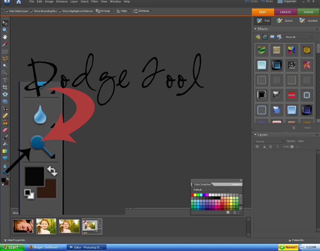
Now you'll select the dodge tool as shown below. Set the exposure to something low like 25-30 because we don't want the whites of the eye to look fake. Also, you'll want to choose a smaller size so we don't go anywhere but the whites of the eye. Once your ready just quickly go over the whites of the eye and this brightens it up a tad. Play around with the exposure to find a level you like.
We now have eyes that pop in our image.
Friday, October 10, 2008
simple touches
I am rarely disappointed when I spend some time playing around in Photoshop. I love playing with all the gadgets and seeing what I come up with.
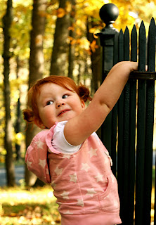
Tonight I started out with the SOOC picture. This was taken at the Saratoga battlefield in Saratoga, NY today. This is Tea hanging off the fence surrounding the monument dedicated to Benedict Arnold's leg. No lie! I made my adjustments using the same method I used in the last lesson. But this time I noticed there was a lot of yellow in the end product and I didn't like it. So to fix it, I went to Enhance/Color Variation and there I played around with increasing and decreasing the colors. So to fix the over-saturation of yellow, I decreased the red once and made it darker, one click. In a future lesson I will show you how to use this same technique to make your image have a sepia tone.
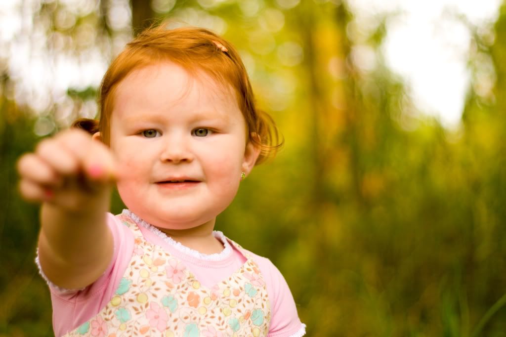
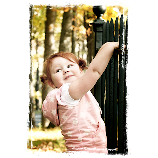
I was very happy with the end result but I wanted to play around a little more and see what I could come up with. So here I made a copy of the above image (ctrl+j) and made my duplicate screen mode. I loved the effect. It makes her look so soft and sweet. I also added my new photo to a grunge frame for added effect.
Wednesday, October 8, 2008
Color pop in photos using Photoshop
I have made up my own way to make images pop a little more. There are a gazillion ways to do it and millions of actions to buy to do it for you. While the actions are wonderful and great to own, and I own a few, it's always nice to do it on your own. This is what I do on almost every picture with minor variations. And while I don't claim this to be the right way, I have discovered that people who share minor details with me make it so I can customize my own way of doing it.
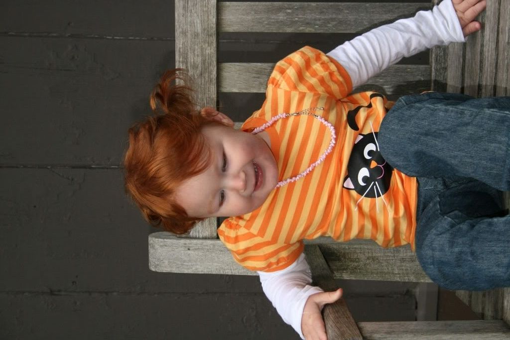
So, with that said, we'll start with our original SOOC (straight out of camera) picture. This picture was taken at Louisa May Alcott's house in Massachusetts over the weekend. Very pretty!
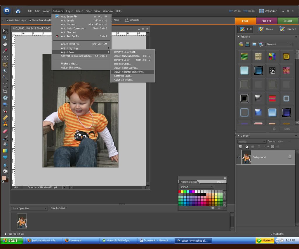
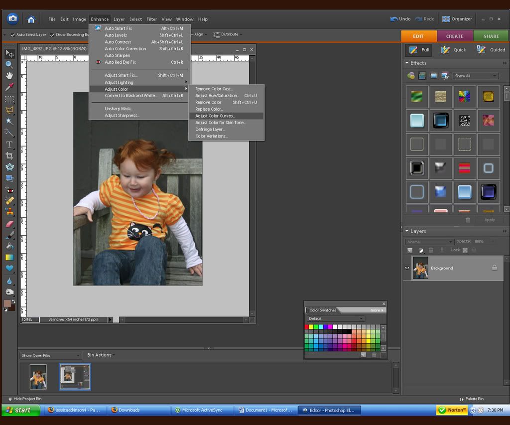
The first thing I do is adjust the color for skin tone. Click on enhance/adjust color/adjust for skin tone. I then adjust the levels until the skin looks normal. Try playing around with this and see all that it can do.
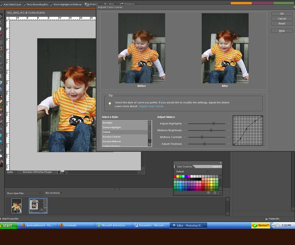
Then I adjust color levels. Enhance/adjust color/color curves
This is never really the same, however, I tend to move it towards the same direction. It just depends how much I move it. Play around with and see what fits right for you and your picture. Every picture and every person are different.
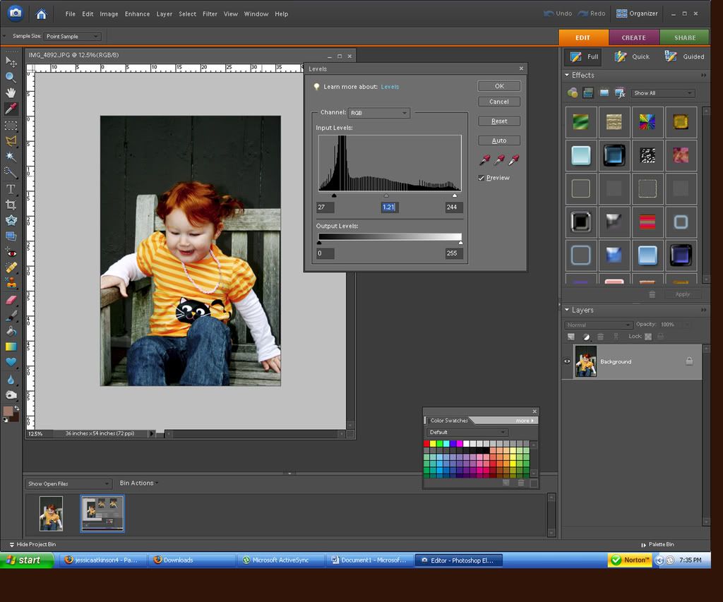
I then adjust the levels. Enhance/lighting/levels. This allows you to add to the dark, middle and light colors in your picture. I tend to move the dark (left) side a touch, the light (right) a little less than dark and move the midtone to the left. Again, every picture and every person are different so play around with it.
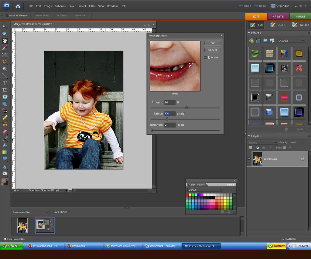
We now have a picture that pops good. I like to adjust the sharpness of my photo next. Enhance/unsharp mask. There are hundreds of standard numbers out there but the one I tend to stick closely with is 86/4/1. However, on this one I did something more like 96/3.5/1.
You can then do your touch ups like removing any blemishes. I adjusted TeƤ's hair color by using the dodge tool to darken it a bit.
Here is a look at our before and after. Have fun and I'd love to see your creation!
Subscribe to:
Posts (Atom)